
Iconic symbol of Bristol, or a sloppy paint job?
“This is supposed to represent the colors of the American flag. That’s why we’re doing this...So if it’s supposed to represent the flag, it ought to be the right colors.”
This item is available in full to subscribers.
Please log in to continue |
Register to post eventsIf you'd like to post an event to our calendar, you can create a free account by clicking here. Note that free accounts do not have access to our subscriber-only content. |
Day pass subscribers
Are you a day pass subscriber who needs to log in? Click here to continue.
Iconic symbol of Bristol, or a sloppy paint job?


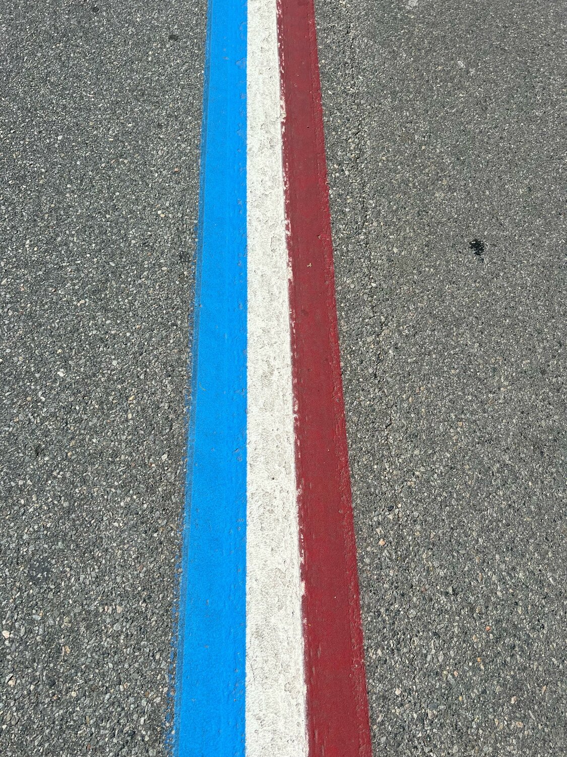


Father Jonathan DeFelice knows colors — much more than one would expect from the president emeritus of a New England college. That’s because he grew up in a painter’s home.
“I grew up very, very sensitive to color, because my father was probably the best house painter in Bristol,” DeFelice said. “In those days [the 1950s and ’60s], there was no computer matching of colors like there is today. My father had a case with dozens and dozens of tubes of paint … He could match any color in town.”
DeFelice’s family moved into the home at 75 Constitution St. in downtown Bristol when he was born 75 years ago, and it has been a family home ever since. DeFelice, an ordained Catholic priest who spent 24 years as president of Saint Anselm College in New Hampshire, is now retired and living in that same home on Constitution Street.
Despite his many years living elsewhere, DeFelice returned often to his hometown and rarely missed a Fourth of July. One of the clear symbols that this town is not like all others — that Bristol is home to the oldest, continuous Independence Day celebration in America — is the red, white and blue center stripe that runs for two and a half miles through the center of town. It is one of the iconic images of Bristol, the focal point for endless paintings, photographs and social media posts.
From DeFelice’s perspective, the center stripe does not look right this year. The colors are all wrong.
“It was the red that really got me this year,” he said. He believes the red of this year’s stripe, which is freshly painted each year by the Rhode Island Department of Transportation (DOT), looks more like maroon — far different than the official red of the U.S. flag.
DeFelice also believes the blue is the wrong color. He describes the color of this year’s stripe as “robin’s egg blue,” while the blue in the U.S. flag should be navy.
“This is supposed to represent the colors of the American flag. That’s why we’re doing this,” he said. “So if it’s supposed to represent the flag, it ought to be the right colors.”
The last thing that bothers DeFelice is the quality of the work. He believes the paint job is rather sloppy. “I’ve always had an appreciation for color and for good work, and I was really disappointed this year,” he said. “Usually these lines are pretty sharp, pretty straight. This year it’s sloppy.”
During his two-plus decades at the helm of Saint Anselm, Father DeFelice led a major rebranding of the college. True to his nature, he was a stickler for the colors chosen to represent the school, the most dominant of which is a deep, rich blue. He was personally involved in the selection of what he ultimately called “Saint Anselm blue,” and he was persistent in making sure all branded materials maintained that color scheme.
Taking it to authorities
After seeing the new paint job a few weeks ago, DeFelice wrote a letter about the red, white and blue stripe and e-mailed it to half a dozen Bristol town officials. No one from the town has so far responded to him.
At the time, DeFelice thought the Town of Bristol painted the stripe. He was unaware that because the parade route runs along a state road, DOT is the responsible party. After he sent his letter to town leaders, he also sent it this paper. The Phoenix then reached out to DOT and asked about the paint job and colors chosen.
DOT spokesman Charles St. Martin first responded to say, “We have no comment on this person’s statement.” When pressed for a deeper reply, he wrote via email: “The colors used are the same colors we have always used.”
DeFelice doesn’t buy it. He said the blue has fluctuated over the years, but has often been much closer to the true blue of the U.S. flag, and the red has always been a much brighter red. He remains disappointed with the final product, and with the lack of concern from anyone in a position of authority.
“Because of the significance of the Fourth of July in this town, we, as much any anybody, should have the right colors,” DeFelice said. “These colors are way off. For Bristol not to have the colors right is a huge mistake.”


